How to Design a Webinar Page: Boost Registrations With These Simple Tips
In today’s digital landscape, hosting a webinar is one of the most effective ways to share knowledge, promote your brand, and generate leads. However, even the most insightful webinar content can fall short if your webinar page isn’t designed to appeal to potential attendees. A well-designed webinar page isn’t merely an online sign-up form—it’s the first impression you make and the critical bridge between interest and commitment. In this article, we’ll explore practical strategies for designing a high-converting webinar page while sharing insights and tips that will help you boost your registrations.
The Importance of a High-Converting Webinar Page
Your webinar page serves as the gateway to your live event. It’s where prospects decide whether to invest their time into learning about your subject matter. A page that captivates and converts can make a significant difference in the success of your webinar series. Consider these key benefits of investing time in the design of your webinar page:
- First Impressions Matter: A clean and professional design inspires confidence and credibility.
- Clear Messaging: Properly crafted text and visuals communicate the value of your webinar effectively.
- Conversion Optimization: Every element is designed with the goal of turning visitors into registrants.
- Audience Engagement: An engaging webinar page can spark curiosity and drive interactions even before the webinar begins.
By carefully crafting your webinar page with both aesthetics and functionality in mind, you create a seamless user experience that encourages prospective attendees to complete the registration process—and stay engaged long after they sign up.
Key Elements of an Outstanding Webinar Page
When it comes to designing your webinar page, focus on these essential elements to help visitors understand what they’re signing up for and why they should care:
1. Clear and Compelling Headline:
Your headline should immediately communicate the webinar topic or its core benefit. Use active language and a tone that resonates with your audience.
2. Engaging Visuals and Layout:
A visually appealing page retains visitor attention. Incorporate high-quality images, an intuitive layout, and branding that reflects your message and style.
3. Concise and Persuasive Copy:
Explain what attendees will gain by joining. Keep it brief but informative, highlighting key benefits without overwhelming the reader with too much information.
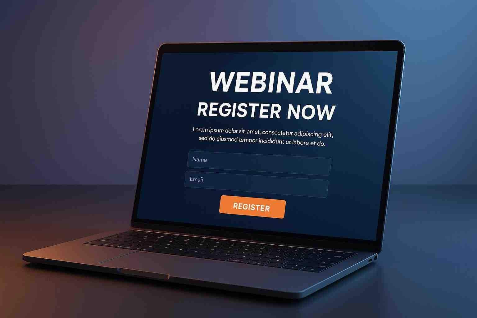
4. Prominent Call-to-Action (CTA):
Make sure the registration button is visible, enticing, and easy to locate. Use contrasting colors and compelling language such as “Register Now” or “Reserve Your Spot.”
5. Trust Signals and Social Proof:
Testimonials, speaker credentials, and past event successes can help build trust with potential registrants. These elements help eliminate doubts and encourage sign-ups.
6. Mobile-Optimized Design:
More users are accessing webinars from mobile devices than ever before. Ensure your webinar page is fully responsive for an optimal user experience on all devices.
Here’s a quick checklist of what your webinar page should include:
- Clear, bold headline
- Engaging visuals and intuitive layout
- Concise, benefits-focused copy
- Eye-catching registration button (CTA)
- Trust signals (testimonials, speaker bios)
- Mobile responsiveness
By combining these elements, you create a pathway that guides visitors effortlessly from interest to registration.
A Step-by-Step Guide to Designing Your Webinar Page
Designing a successful webinar page doesn’t have to be complicated. Here’s a step-by-step guide to help you create a page that drives conversions and builds excitement before the event begins.
Step 1: Define Your Objectives
Before diving into design, clarify the primary goal of your webinar page. Ask yourself:
- What action do I want visitors to take?
- How can I best demonstrate the value of my webinar?
Having clear objectives will guide your design decisions and help you prioritize key elements that must be present on the page.
Step 2: Understand Your Audience
Your target audience will shape the look and feel of your webinar page. Consider the following:
- What are their pain points?
- How does your webinar address their challenges?
- What design elements resonate with them?
Tailor your messaging and design based on these insights. When the copy and visual cues speak directly to your audience, they’re more likely to engage and register.
Step 3: Craft Your Messaging
A webinar page must have compelling copy that communicates the webinar’s benefits effectively. Focus on these aspects:
- Start with a strong headline.
- Use subheadings to break up text and clarify the main points.
- Include a persuasive paragraph that answers, “What’s in it for me?” for prospective attendees.
Step 4: Design with Clarity and Simplicity
Keep your design clean, uncluttered, and focused on the primary goal of registration. Consider these best practices:
- Use ample white space to prevent information overload.
- Ensure the registration form is short, simple, and only asks for key details.
- Maintain a consistent color scheme that aligns with your brand.
- Use contrasting colors to highlight important elements, especially the CTA.
Step 5: Incorporate Trust Signals
Incorporating trust signals is crucial in reinforcing credibility. Consider adding:
- Speaker bios that highlight expertise and relevance.
- Customer testimonials or case studies from previous webinars.
- Logos of reputable organizations or partners involved with your event.
Step 6: Optimize for Mobile
A significant portion of your audience might access the webinar page from smartphones or tablets. Confirm that your design is fully responsive:
- Test how the page appears on multiple devices and browsers.
- Simplify navigation and form fields for ease of use on smaller screens.
Step 7: Test and Iterate
Once your webinar page is published, continuously analyze its performance. Conduct A/B tests to experiment with different headlines, images, or CTA placements. Use analytics to understand visitor behavior and make improvements based on data-driven insights.
Following these steps will help you create a webinar page that not only looks inviting but also drives conversions by focusing on user experience and clarity.
Common Pitfalls to Avoid
Even with the best intentions, some common mistakes can derail your webinar page’s success. Being aware of these pitfalls ensures that you’re prepared to create the most effective design possible. Here are some areas to watch out for:
- Overcrowded Layouts: Too much information or clutter can overwhelm visitors. Keep your design clean and prioritize key messages.
- Weak Value Proposition: If visitors can’t quickly see what they will gain from attending, they’re likely to lose interest.
- Hidden or Weak CTAs: Your registration button should be impossible to miss. A subtle or buried CTA might reduce conversion rates significantly.
- Ignoring Mobile Optimization: A page that doesn’t perform well on mobile can alienate a large portion of your audience.
- Neglecting Trust Signals: Without testimonials or social proof, your page may fail to build the necessary trust to convince visitors to register.
Avoiding these pitfalls ensures that your webinar page remains effective in drawing attention and converting visitors into engaged participants.
Additional Tips to Enhance Registrations
Once you have the foundational design elements in place, consider these additional tips to further optimize your webinar page and boost registrations:
- Create a Sense of Urgency: Encourage immediate action by using time-limited offers or early bird registrations. A countdown timer can also instill a feeling of urgency.
- Utilize Engaging Multimedia: Videos or brief animation that explain the webinar’s value can capture attention better than static text alone. A speaker introduction video, for example, can humanize your event.
- Segment Your Audience: If you have varied content, create different webinar pages that speak to different segments of your audience. Tailored messaging makes each visitor feel like the event is designed specifically for them.
- Include FAQs: Address any potential concerns directly on the page. This reduces friction by pre-empting common questions related to the event, technical issues, and more.
- Highlight Interactive Elements: If your webinar includes Q&A sessions or live polls, make sure to mention these interactive features. Prospective attendees appreciate knowing they will have a voice during the event.
Consider this additional checklist when refining your webinar page:
- Use a countdown timer for a sense of urgency.
- Embed engaging multimedia to capture attention.
- Personalize the copy for different audience segments.
- Include an FAQ section to pre-emptively address concerns.
- Emphasize interactive features to drive engagement.
Implementing these refined touches can significantly improve the effectiveness of your webinar page, ultimately leading to higher conversion rates.
Leveraging Technology for Better Webinar Page Performance
Technology plays a crucial role in how well your webinar page performs. With the aid of modern webinar platforms, you can easily integrate registration forms, email reminders, and even analytics into your page. This technological edge not only streamlines the registration process but also provides valuable insights into visitor behavior.
Using Integrated Tools for Optimization
Modern tools allow you to monitor page performance and make data-driven improvements. Consider the following strategies:
- Analytics and Tracking: Use built-in analytics to track registrations, bounce rates, and on-page behavior. This data will help you fine-tune the design and messaging.
- Responsive Design Tools: Leverage website builders or content management systems that ensure your webinar page remains mobile-friendly and accessible.
- CRM Integration: Seamlessly connect your registration form with your customer relationship management software, allowing you to nurture leads before and after the webinar.
Enhance Your Webinar Page with JetWebinar
One powerful tool that can elevate your webinar hosting experience is JetWebinar. This platform not only simplifies the process of hosting live events but also provides an array of features that help in enhancing your webinar page. With advanced functionalities, cloud-based reliability, and interactive options for your audience, JetWebinar can be the key to a seamless and engaging webinar experience.
Some notable features of such webinar hosting platforms include:
- Real-time audience engagement tools: polls, Q&A, and chat functions.
- Automated email reminders to keep attendees informed.
- Customizable registration pages that match your branding.
- Detailed analytics to track attendee behavior and overall performance.
By integrating a robust platform like JetWebinar, you leave behind the headaches of managing logistics and technical glitches, allowing you to focus on delivering high-quality content.
Bringing It All Together
Designing an effective webinar page is a blend of art and science. It requires a keen understanding of your audience, a clear articulation of the webinar’s value, and an emphasis on simplicity and trust. The journey begins with a strong, engaging visual layout and compelling copy, and continues with ongoing testing and optimization to keep your registration numbers climbing.
Key points to keep in mind:
- A clear, engaging headline and persuasive messaging are critical.
- Trust signals such as testimonials and speaker bios can significantly boost credibility.
- Ensure your registration form is simple, mobile-optimized, and paired with a prominent call-to-action.
- Utilize urgency, multimedia, and segmentation to further engage your audience.
- Leverage technology and integrated tools to enhance the overall user experience.
Every element on your webinar page should work in harmony, guiding the visitor naturally towards the decision to register. With these strategies, you’re well on your way to transforming a standard landing page into a high-performing registration magnet.
Conclusion
A well-designed webinar page is more than just an online registration form—it’s a dynamic tool that can significantly boost viewer engagement and registration rates. By focusing on clear messaging, appealing design, and user-friendly navigation, you are setting the stage for a successful webinar experience. Remember, the journey from visitor to registrant hinges on the clarity and appeal of your page.
Start by refining your messaging, simplifying the registration process, and continuously testing elements to see what works best for your audience. With thoughtful design and attention to detail, your webinar page can become a powerful tool in your digital marketing arsenal, capturing the interest of potential attendees and converting that interest into actionable registration.
Ready to take your webinar page to the next level? Discover how JetWebinar can transform your online events. Sign up for a free trial today and experience firsthand the benefits of a platform built to streamline your registration process and enhance audience engagement. Whether you’re a small business owner, a digital marketer, or an industry expert, JetWebinar offers the professional tools you need to host webinars that leave a lasting impression.
Embrace these simple tips, and watch your registrations soar as your webinar page becomes the gateway to an engaged and growing audience. Happy designing!