How to Instantly Improve Your Webinar Page: Secrets for Higher Signups
In today’s fast-paced digital world, your webinar page is more than just a simple landing page—it’s your handshake with potential attendees, your chance to make a memorable first impression, and the gateway to your valuable content. Whether you’re hosting an educational seminar, a product demo, or an expert panel discussion, your webinar page plays a crucial role in converting curious visitors into registered attendees. In this article, we’ll dive into actionable tips, design insights, and proven strategies to instantly improve your webinar page for higher signups.
The Importance of a Well-Optimized Webinar Page
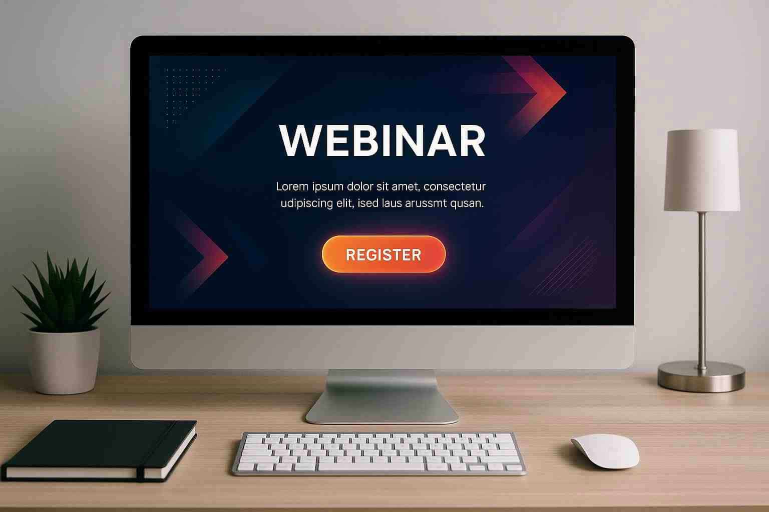
Imagine scrolling through a website and coming across an uncluttered, visually engaging page that immediately communicates value. It compels you to click on the "Register" button without second thought. That’s the power of a well-optimized webinar page. It not only enhances your credibility but also builds trust and excites your audience about what’s to come.
Here’s why your webinar page is critical:
- First Impressions Matter: The moment someone lands on your page, they form an opinion about your presentation. A clean, professional, and relevant design sets the right tone.
- Enhanced User Engagement: An engaging design and clear messaging can guide visitors smoothly toward registration, reducing bounce rates.
- Increased Conversions: A compelling webinar page with a strong call to action (CTA) can significantly boost signup rates, converting passive interest into active participation.
- Brand Building: Your webinar page reflects your brand identity. A thoughtfully designed page reinforces the trustworthiness of your webinar content.
A well-crafted webinar page becomes the bridge between interest and action—transforming website visits into meaningful registrations.
Understanding Your Audience and Crafting a Compelling Message
Before you start redesigning or tweaking your webinar page, it’s essential to understand who you’re trying to reach. Different audiences have different expectations, and knowing their motivations can help you tailor your message to resonate more effectively.
Consider These Key Points:
- Identify Your Target Audience: Are you speaking to industry experts, budding entrepreneurs, or tech-savvy professionals? Knowing your audience helps you craft a message that speaks directly to their needs.
- Define Their Pain Points: What challenges is your audience facing? Your webinar should promise to offer actionable solutions, and your webinar page must highlight these benefits.
- Speak Their Language: Use a conversational tone that feels personal yet professional. Avoid overly technical jargon unless it genuinely serves the interest of your audience.
By addressing these questions, you ensure that every word on your webinar page aligns with the expectations of your audience. Tailored messaging is key to making visitors feel like your webinar was designed just for them.
Key Elements of a High-Converting Webinar Page
Transforming your webinar page into a conversion powerhouse involves a mix of effective copy, compelling visuals, and intuitive design. Here are the crucial elements that every high-performing webinar page should have:
- Engaging Headline: The headline is the first thing visitors see. It should capture attention and clearly state the value of your webinar. Think of it as your elevator pitch in just a few words.
- Compelling Subheadline: Follow your main headline with a subheadline that deepens the intrigue, framing the webinar as the must-attend event of the season.
- Benefit-Driven Content: Explain how the webinar will solve problems or offer new insights. Instead of listing features, focus on outcomes—what attendees will gain by participating.
- Social Proof: Including testimonials, case studies, or logos of reputable partners can significantly boost credibility and trust.
- Simple Registration Form: A complicated or lengthy form can deter signups. Keep it concise by asking only for the essential information.
These features work together to create a seamless experience for your visitors, guiding them naturally toward registration. Consider this checklist when evaluating your current webinar page:
- Clear, concise headline and subheadline
- Benefits and value proposition clearly stated
- Trust signals like testimonials and social proof
- User-friendly registration form with minimal fields
- Prominent and inviting call to action
Design and User Experience: Less is More
An intuitive design and smooth user experience are as important as compelling copy. A webinar page that looks cluttered or difficult to navigate can quickly lose your visitor’s interest. Here are some design best practices to consider:
Design Best Practices for a Sleek Webinar Page:
- Keep It Clean: A clutter-free layout ensures that your message isn’t lost in a sea of information. Embrace plenty of white space to allow key elements to stand out.
- Mobile Responsiveness: With an increasing number of users accessing content on smartphones and tablets, ensure your webinar page is optimized for all devices.
- Visual Hierarchy: Structure your content so that the most important information—like the CTA button and webinar benefits—stands out. Use larger fonts or brighter colors to highlight these elements.
- Loading Speed: Optimize your images and video content so that your page loads swiftly. A slow page can frustrate visitors and lead to higher bounce rates.
A visually appealing webinar page combined with a smooth user experience can make all the difference. Ultimately, you want visitors to feel confident and inspired to register, viewing your page as both user-friendly and professional.
Crafting Copy That Converts
While design draws visitors in, it’s the copy that ultimately persuades them to sign up. Using clear, concise, and benefit-oriented language is essential for keeping potential attendees engaged. Here are key strategies to refine your webinar page copy:
- Tell a Story: Begin with a narrative that highlights the problem your audience is facing and lead naturally into how your webinar will be the solution.
- Use Persuasive Language: Focus on the benefits, outcomes, and transformations that participants can expect. Avoid generic phrases and instead use specific, action-oriented words.
- Simplify Your Message: Aim for simplicity in your language. Long-winded explanations can confuse or bore your visitors. Break down the information into digestible points.
Consider these actionable tips to enhance your copy:
- Use bold headlines and subheadings to organize content.
- Limit the use of technical jargon unless it aligns with your audience’s familiarity.
- Incorporate real-life examples or case studies to illustrate benefits.
- Employ bullet points to summarize the key takeaways from the webinar.
- Include a strong call to action that clearly directs visitors on what to do next.
By marrying effective copy with a compelling design, you’re more likely to grab the attention of your visitors and convert that interest into a solid list of registered attendees.
Testing, Measuring, and Iterating for Success
Building the perfect webinar page is not a one-time effort—it’s an ongoing process that involves testing, measuring, and refining your approach based on how users interact with your content. A/B testing different elements on your page can uncover what truly resonates with your audience.
Metrics to Monitor and Optimize:
- Registration Conversion Rate: Track what percentage of visitors end up registering for your webinar.
- Bounce Rate: Measure the number of visitors who leave your page without taking any action.
- Time on Page: Monitor how long visitors are engaged with your content. Longer times may indicate deeper interest.
- Click-Through Rate (CTR) on CTA Buttons: Analyze how effectively your call to action is prompting signups.
- Engagement with Multimedia Elements: Check if visitors are watching your videos or interacting with other dynamic content.
Steps for Effective Testing:
- Identify one element to change at a time (e.g., headline, CTA color, form length).
- Run the test for a sufficient period to gather meaningful data.
- Compare the performance of each variant and implement the one that provides better results.
- Iterate based on the data; continuous improvements can lead to significantly higher conversion rates over time.
Each test helps you understand your visitors better and refines your webinar page into a more effective conversion tool.
Leveraging the Right Tools to Enhance Your Webinar Page
Even with impeccable design, copy, and testing strategies, sometimes the underlying technology can make or break your webinar page’s performance. Using the right tools can simplify the entire process, allowing you to focus on delivering quality content and engaging with your audience.
One platform that stands out in the webinar hosting arena is JetWebinar. This robust solution offers a comprehensive suite of features tailored specifically for webinar hosting, ensuring that every part of your webinar page—from registration to real-time engagement—is seamlessly optimized.
Why Consider a Platform Like JetWebinar?
- User-Friendly Interface: JetWebinar is designed with simplicity in mind, ensuring that even those less tech-savvy can navigate and set up their webinar page effortlessly.
- Powerful Interactive Features: From live chat to interactive polls, JetWebinar provides the tools you need to keep your audience engaged during the webinar.
- Comprehensive Analytics: Measure your webinar page’s performance with in-depth analytics. Insights on viewer behavior and engagement help you continually improve.
- Customizable Templates: With a variety of professional templates, you can create a visually appealing webinar page without needing advanced design skills.
- Seamless Registration Process: Simplify the sign-up process to prevent potential attendees from dropping out before registration.
Using a platform like JetWebinar allows you to focus on what really matters—delivering high-quality content and engaging your audience—while ensuring that your webinar page is optimized for conversions.
Bringing It All Together
Optimizing your webinar page might seem like a daunting task, but with a clear strategy encompassing design, copy, and audience insights, it becomes a highly manageable—and even rewarding—effort. The key is to treat your webinar page as a dynamic extension of your brand, one that evolves based on user behavior and the latest trends in digital marketing.
By following these actionable insights, you’ll be well on your way to transforming your webinar page into a conversion engine:
- Develop a compelling headline and value proposition that speaks directly to your audience.
- Simplify your registration form to remove barriers to entry.
- Ensure your design is clean, responsive, and highlights the key elements that drive engagement.
- Craft persuasive copy that not only informs but also inspires action.
- Regularly test and iterate your approach to maximize your webinar page’s performance.
Taking time to understand your audience, streamline your design, and refine your messaging can dramatically enhance your signup rates. Each element of your webinar page should work together harmoniously, offering visitors a clear path from interest to registration.
The Road Ahead: Your Next Steps
Improving your webinar page isn’t just about making cosmetic tweaks—it’s about embracing a strategic approach that places the user at the heart of your design. By continually testing and refining your page, you create a better experience for your audience and set the stage for successful webinars that deliver value and drive business outcomes.
Consider creating a roadmap for your next few months that outlines:
- Which aspects of your webinar page will be prioritized.
- Which elements need testing and analysis.
- A timeline for updates and iterations based on the data you gather.
This proactive approach ensures that your webinar page remains relevant and effective, no matter how the digital landscape evolves.
Ready to Transform Your Webinar Experience?
Your webinar page is the first step toward connecting with your audience on a deeper level. By focusing on excellent design, targeted messaging, and continuous improvement, you’re well on your way to higher signups and more impactful sessions. Remember, each adjustment you make not only enhances the user experience but also builds trust and boosts your credibility as an expert in your field.
If you’re looking to take your webinar hosting to the next level, consider leveraging the robust features of JetWebinar. With its user-friendly interface, powerful interactive tools, and comprehensive analytics, JetWebinar is designed to help you maximize engagement and drive conversions.
Take the leap and see the difference for yourself—sign up for a free trial of JetWebinar today and experience firsthand how an optimized webinar page can transform your audience engagement and elevate your marketing efforts.
Ready to boost your webinar signups? Explore JetWebinar’s intuitive platform and discover how its innovative features can revolutionize your webinar hosting experience. Sign up for a free trial now and take the first step towards creating a webinar page that truly converts!
Remember, a small improvement in your webinar page today could lead to significant results tomorrow. Happy hosting!