Webinar Page Not Engaging Visitors? Here’s What You’re Doing Wrong
In today’s competitive online landscape, your webinar page is more than just a registration portal—it’s the first impression that can make or break your event’s success. If your visitors aren’t converting, chances are your webinar page is not doing its job effectively. In this article, we’ll dive deep into common mistakes that reduce user engagement, share actionable tips to revitalize your page, and provide real-life examples of improvements that generate results. Whether you’re new to hosting webinars or a seasoned pro, understanding these pitfalls and learning how to fix them can dramatically boost your registration rates and overall engagement.
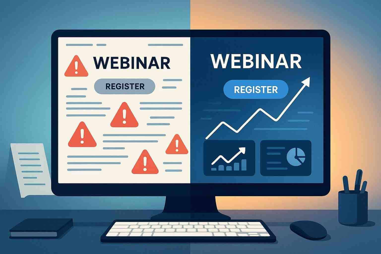
Understanding the Role of a Webinar Page
A well-designed webinar page sets the stage for success. It’s where potential attendees decide whether your event offers the value they’re looking for. When a visitor lands on your webinar page, they want to understand quickly what the webinar is about, why it’s important, and how they can benefit from attending. Unfortunately, if your page is cluttered or unclear, these benefits can be lost in translation.
Imagine landing on a page that has dull text, confusing layouts, or an ambiguous call-to-action (CTA). You’d likely bounce off in search of something more engaging. Your webinar page should captivate, inform, and compel visitors to sign up, and missing any of these elements can have a detrimental effect on your conversion rates.
Common Pitfalls That Diminish Engagement
Even if you’re investing in quality content, overlooking core design and messaging principles can render your efforts ineffective. Here are some common mistakes that may be causing your webinar page to underperform:
- Unclear Value Proposition: Visitors need to understand the benefits of attending your webinar within seconds. If your headline or subheading doesn’t clearly communicate what they stand to gain, they’re likely to leave.
- Cluttered or Dated Design: A page that is too busy with text, images, or ads can overwhelm the visitor and distract them from the main message.
- Poor Call-to-Action (CTA): An ambiguous or unattractive CTA makes it unclear what the next step should be, significantly reducing conversion rates.
- Lack of Social Proof: Testimonials, success stories, or data that support your claims build trust. Without these elements, visitors might not see the credibility of your event.
- Slow Loading Speeds: In today’s fast-paced digital world, even a few extra seconds in load time can make visitors click away.
- Inadequate Mobile Optimization: With a growing number of visitors using mobile devices, a non-responsive or unoptimized design can be a major drawback.
These pitfalls are not just theoretical—they are real barriers that many webinar hosts face. Identifying which of these issues resonates most with your audience is the first step toward crafting a more engaging experience.
How to Revitalize Your Webinar Page
Improving your webinar page requires a strategic approach that considers both design and content. Here are actionable strategies to help you turn a lackluster page into a conversion machine:
- Clarify Your Messaging: Use headlines and subheadings that immediately convey the main benefits of the webinar. Ensure that the key takeaways are visible without requiring the visitor to scroll extensively.
- Streamline Your Design: A clean, modern design can significantly boost engagement. Focus on white space, high-quality visuals, and a layout that guides the visitor’s eye toward the CTA.
- Enhance Your CTA: Craft a compelling call-to-action that not only tells visitors what to do but also excites them about the benefits of signing up.
- Incorporate Trust Signals: Add testimonials, case studies, or logos of partner companies to build credibility and trust among potential attendees.
- Optimize for Speed and Mobile Use: Make sure your page loads quickly and is fully optimized for mobile devices, ensuring a seamless experience for all visitors.
- Leverage Multimedia: Videos or interactive elements can significantly boost engagement by providing dynamic content that explains the webinar’s benefits in an engaging way.
By applying these improvements, your webinar page can transform from a static registration portal into a dynamic gateway that excites visitors. Taking the time to focus on these aspects can differentiate your event from the competition.
Crafting Engaging Content for Your Webinar Page
The copy on your webinar page plays a pivotal role in engaging visitors. It should be authoritative yet conversational—a friendly invitation that encourages people to join your event. Let’s explore some important copy elements that can make your page more effective:
- Compelling Headlines: Your headline should be succinct and promise value. A headline like “Discover the Secrets to Skyrocketing Your Sales” immediately tells the visitor what they stand to gain.
- Benefit-Driven Subheadings: Subheadings should expand on the promise made in the headline, reinforcing the benefits of attending the webinar.
- Clear Descriptions: Offer a brief but impactful description of what the webinar will cover. Avoid industry jargon that could alienate a portion of your audience.
- Supporting Visuals: Pair your text with images or short videos. Visual elements not only break up the text but also provide context and reinforce the benefits described.
- Social Proof: As mentioned, include testimonials or success stories that give real examples of how your webinar has helped others.
Consider these best practices when writing your content:
- Start with a strong, benefit-oriented headline.
- Craft concise paragraphs that lead smoothly into one another.
- Use bullet points for key benefits, session highlights, and takeaways.
- Incorporate quotes or testimonials to back up your claims.
- End with a decisive and inviting CTA.
Effectively combining these elements will help you capture the interest of your visitors and encourage them to act.
Enhancing User Experience Through Better Design
A visually appealing design can significantly influence how visitors perceive your webinar page. A cluttered or poorly organized page distracts from your core message and can compromise user experience. Here are some design tips to consider:
- Consistent Branding: Ensure your webinar page reflects your brand’s colors, fonts, and overall style. A consistent look creates a professional image and builds trust.
- Responsive Layout: With many users accessing pages via mobile devices, a responsive design ensures that your content looks great on any screen size.
- Intuitive Navigation: The journey from landing on your page to clicking the registration link should be intuitive. Minimize distractions and keep the focus on the path to registration.
- Engaging Visual Hierarchy: Use contrasting colors to highlight the CTA and important sections of the page. This leads the visitor’s eye naturally down the page.
- Whitespace Utilization: Don’t underestimate the power of a clean layout. Adequate whitespace helps to reduce cognitive overload and allows your key messages to stand out.
A well-thought-out design can work hand in hand with your content, ensuring that both visual and textual elements complement each other to maximize engagement.
Leveraging Data and Feedback for Continuous Improvement
After implementing changes to your webinar page, it’s essential to monitor performance and make tweaks as needed. Data-driven decisions can help you understand what resonates with your audience and what areas might need further improvement. Consider the following approaches:
- A/B Testing: Run tests with different headlines, visuals, or CTA placements to see which combination results in higher conversions.
- Analytics Tools: Utilize tools like Google Analytics to track visitor behavior, bounce rates, and conversion metrics. Look at where visitors drop off and adjust accordingly.
- User Feedback: Don’t be afraid to ask your visitors for feedback. A quick survey or a direct follow-up email can provide invaluable insights into their experience.
- Continuous Refinement: Use the gathered data to guide ongoing improvements. Successful optimization is a repetitive process—continually tweak and test to ensure your webinar page remains effective.
Key Data-Driven Tips
- Monitor load time and ensure your page remains fast to avoid losing impatient visitors.
- Analyze the performance of your CTA by measuring clicks versus actual registrations.
- Pay attention to mobile user behavior in your analytics to ensure the experience is optimized across all devices.
By paying close attention to these metrics, you can make informed decisions that lead to sustained improvements in user engagement.
Real-Life Success Stories: Turning Theory Into Practice
Sometimes, the best way to understand the impact of these strategies is through real-life examples. Consider the story of a digital marketing coach who revamped her webinar page with a few strategic tweaks:
- Before: Her initial webinar page was text-heavy with a generic headline and a registration form buried in a wall of information. Her engagement rates were low, and many potential attendees dropped off before completing the registration process.
- After: After implementing a clear, compelling headline, adding a short explainer video, and incorporating a single, eye-catching CTA button supported by testimonials, her webinar page saw a dramatic increase in sign-ups. The streamlined design and focused messaging helped visitors quickly understand the benefits of joining the session.
This transformation was not just due to one change but a series of informed decisions that worked together to enhance the overall user experience. The improvement in her registration and engagement metrics underscores the importance of continually refining every element of your webinar page.
Mobile Optimization: Catering to On-the-Go Visitors
Don’t underestimate the growing audience accessing content via their smartphones or tablets. If your webinar page isn’t optimized for mobile devices, you’re potentially losing a significant portion of your audience. Mobile optimization isn’t just about making text readable—it’s about ensuring a seamless, frictionless experience for every user.
Mobile Design Best Practices
- Simplified Layout: Use a clear, vertical layout that is easy to scroll through. Avoid complex grids that might work on desktops but become confusing on mobile.
- Touch-Friendly Elements: Ensure buttons and links are large enough to tap without error. This improves the likelihood that mobile users will engage with your CTAs.
- Fast Load Times: Mobile users often operate on slower networks compared to desktop users. Optimize images and compress files to ensure that your page loads quickly.
- Clear Navigation: A floating menu or an easily visible CTA can help guide users on mobile devices.
By focusing on mobile optimization, you make sure that your webinar page is accessible and engaging, regardless of how visitors choose to access it.
A Recap of What You Should Do Differently
Once you’ve implemented the right changes, it’s important to keep the improvements in mind for ongoing success. Here’s a quick summary of action items to keep your webinar page performing at its best:
- Ensure your messaging is clear and benefits are immediately visible.
- Maintain a clean and modern design that guides visitors effortlessly to the registration button.
- Place persuasive CTAs in visible, prominent locations.
- Utilize social proof to build trust and credibility.
- Optimize both your page speed and mobile responsiveness.
- Continuously test and adapt using data and user feedback.
Conclusion
Your webinar page is a critical tool in your digital marketing arsenal. When it falls short, you risk losing potential attendees and underachieving on your event goals. By understanding common mistakes—from unclear messaging and design clutter to poor mobile optimization—and implementing targeted improvements, you can reinvigorate your page to captivate and convert visitors effectively.
Remember, the journey to an engaging webinar page is continuous. Embrace the process of testing, refining, and evolving not only to meet the expectations of today’s digital audience but also to stay ahead in a rapidly changing environment.
If your webinar page isn’t engaging visitors as it should, it’s time to reassess your strategy, streamline your design, refine your content, and focus on providing a seamless experience for every user. With the right approach, you can transform a lackluster page into an engaging gateway that drives sign-ups and fosters deeper connections with your audience.
Ready to take your webinar hosting to the next level? Discover how JetWebinar can help you create a high-converting, engaging webinar page that captivates visitors from the moment they land. Sign up for a free trial today and experience firsthand the powerful features designed to boost your event’s success.